 Batoi Corporate Office
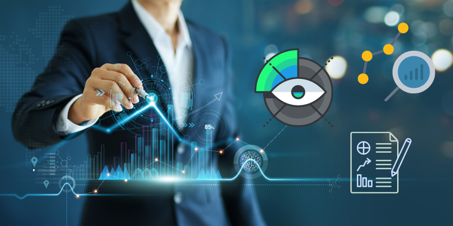
Data is the lifeblood of modern businesses. It helps us gain clarity about the company and the market, make predictions for the future, and drive high-quality decision-making. However, data alone (in its raw format) isn't very useful, although it is a good starting point. People are famously bad at interpreting data in its basic form. For example, exceptionally few people would be able to look at a spreadsheet with rows and rows of numbers and be able to find a pattern instantly - it's just not how our brains work. This is where data visualization, reporting, and analytics come in. All three are distinct, but they work together to transform how we interpret data and harness it to achieve business goals.
What Is Data Analytics?
Data analytics is the process of bringing structure and order to the data we collect. It's the science of analyzing raw data to find the trends, conclusions, and solutions hidden within. In other words, data analytics empowers businesses to extract valuable insights from data that would otherwise be missed.
Today, data analytics is done chiefly using specialized software that utilizes automation and machine learning algorithms. Various business functions benefit from data analytics. For example, companies can improve customer service by analyzing customer behavioral data, sales data, and more to find valuable insights into their customers. Armed with these insights, the business can then tailor customer service to meet the needs of their customers and offer more personalization.
Advanced data analytics tools provide several benefits over manually analyzing data. Firstly, they are much less biased. People tend to only look for trends they've already considered or expect to see and will entirely miss patterns they're not looking for. However, software doesn't suffer the same problem - it can find patterns you never even thought of. Secondly, automated tools allow businesses to conduct data analytics projects much faster. And lastly, analytics solutions make data science more accessible to companies of all sizes. Data scientists are in short supply but in high demand, and not every company needs (or can afford) a full-time data scientist.
Data Reporting
A report is an evaluation tool used to communicate relevant business information efficiently and succinctly. Reports use historical and current data to provide insight into a company's operations or performance and are a base for future decision-making.
Data Visualization
Data visualization is the process of presenting information using visual elements like graphs, charts, and maps. Patterns found in data analysis can be portrayed using these visual elements and then inserted into reports for viewing and interpretation. However, the data included in graphs and other visual elements doesn't have to undergo analysis, and sometimes raw data is used.
Data visualization is a critical reporting technique because it helps us tell a story with data and communicate information extremely effectively when done well. People are visual creatures (sight is our dominant sense), so we find it easier to interpret data when we see it in a visual format. When we see colors and shapes, our eyes are automatically drawn to them, and information processing begins immediately. Visualization also helps us spot anomalies, outliers, clustering, and local trends easily compared with looking at spreadsheets and databases.
Some other benefits of data visualization include:
Using Dashboards to Tell a Story
As we touched on above, one of the primary benefits of data visualization is its storytelling power. Companies can easily create narratives through graphs and diagrams, conveying the overall message in a much cleaner and more engaging way.
Speed Up Decision Making
Visual displays of data allow us to identify patterns and draw conclusions instantly. How fast? Well, humans process visual images an eye-watering 60,000 times faster than text. So being able to interpret data quickly means we can also make critical decisions faster.
Highlighting Areas That Need More Attention
Putting raw data into a graph or other visual element can highlight previously unseen trends. Businesses can then use this information to inform further data analysis. For example, creating a visual representation of sales data might show that a small number of customers spend a lot of money with your business. You can then use this information to dive more deeply into those customers and analyze what traits they share, what motivates them to spend, and why they remain loyal to the brand.
Finding Errors
Unfortunately, despite our best efforts, sometimes erroneous data is inevitable. Often, this data goes unnoticed in a spreadsheet or database but becomes immediately apparent once transformed into a visual. This is important because accurate data is vital to high-quality data analysis.